Replacing Legacy Dry Cleaning Software: From 1990's POS to Scalable Modern SaaS
- Oct 20, 2025
- 39 min read
Updated: Feb 19
The following case study was written by me and not AI. All flaws, personality, and ideas are my own. Sincerely, B.P.
TL:DR. I led the redesign efforts to replace our company's legacy app from 1990. the redesign. Here is the results of my impact :
Replaced 30 year old legacy software with new web app
Simplified complex workflows resulting in faster and more accurate sales
New features significantly improved quality of life for customers
Cut training costs in a high-turnover environment from days to hours.
Increased developer production by 80% by introducing design thinking, as the company's first UX designer.
Reduced customer support calls by 60% through improved new product.

Can't read it all Skip ahead to any key moment
Outline
History & Industry Knowledge
Discovery Phase
Research Phase
Design Process
The Future of SPOT/Connect
Reflection
Recommendations
1. History & Industry Knowledge
1.1 Brief History of Spot

Since 1991 Spot Business Systems has been the leading point of sales software for the dry cleaning industry. The company was started by a couple of developers who saw an opportunity to bring the dry cleaning industry from the age of paper tags to the digital age. The original program was built for DOS, then moved to CD applications until today, where users can download the application to their desktop computer.
Before Spot, many cleaners had to track thousands of clothing items by using complex color coded paper tag systems attached to customer orders. This often lead to human errors such as mislabeling clothing, returning the wrong items to customers and lose of revenue for these companies. Occasionally, the tags would fall off of orders, making identifying the customer even harder.

Spot’s software was a game changer allowing users to bring in clothes, set due dates, associate clothing descriptions on a barcode, track clothing as it went thru the cleaning plants, let end consumers pay for their orders and so much more.

(Current SPOT Interface)
Over the year's Spot's products have garnished a reputation as being dependable, highly customizable, and rich with complex settings. Users could manage their pricing tables, notify customers when orders were done, manage their delivery routes, and more.
It became so well-loved that even 30 years later, it is still being supported and used today. Spot’s software has spread across North America, parts of Europe, and even into the Middle East. It is used by over 10,000 users, ranging from small mom and pop cleaners to large industry leaders such as Tide cleaners.
To quote a user I interviewed once:
"The program is big. Other companies may look better but SPOT has more functionality. Everyone uses SPOT...what seperates us from other guys is that we use SPOT to it's fullest." Jeff Kitches Village Cleaners
While SPOT has been the leader in the dry cleaning industry, new & upcoming competitors have threatened their reign. These competitors boasted that their products were more modern, leaving Spot feeling outdated.
Not wanting to lose all the ground Spot has made over the years, they decided it was time to hire a product manager & the company's first UX designer. This would help secure their place as the industry leader and innovator. This is where my story begins.
💡1.2 Design Thinking Comes to SPOT
In 2020, right before the pandemic hit, I was hired to create a brand new web based product to replace SPOT’s legacy software. As you can imagine, bringing a 90's application in to the modern era was no small undertaking. This was a chance for SPOT to reimagine its products since the technology has significantly changed since SPOT was first created.
Since I was the first designer in the company's history, we needed to change the way we worked. We needed to increase the company's understanding of the role that product and UX played. We needed to be more strategic about the feedback we were given. We needed to establish new habits and patterns.
Rather than developing one time features and forgetting them. We needed to solve the underlying problems. What SPOT needed was a multi pronged attack to shift the culture to be more user centric.
In order for me to succeed in my job, I needed to:
Become a subject matter expert in dry cleaning
Learn about SPOT
2.1 Understand its current state
2.2 What was the Culture like?
2.3 What Tools did they use?
2.4 What key meetings needed to be held?
2.5 Developer Designer relations
Identify & empathize with our primary user
Be familiar with our competitors
Establish a Design thinking, systems, and workflows
Over the course of the next five years, I would achieve all these goals and more.
Results
Introducing design thinking to the team increased productivity by 80-90%
Established design systems reduced onbaording new developers by months
Exposing the gaps and weakness of the sytem lead to better designed products
Better tools lead to less developer errors & better communication
🏈 1.3 The Kickoff Meeting
Like all good products, we began our journey with a multi day kickoff meeting. My objective was to learn all I could about the industry, our competitors, the state of our products, and to understand our customers.
We went over tons of question,s such as:
Understanding the product
Tell me about the history of your products?
What is the purpose of this software?
What prompted the redesign?
What are the goals of the application?
How do you measure these goals?
What problems or needs are we aiming to solve?
Understanding the competition
Who are our competitors?
How are we better than them? How are we worse?
Why do people choose us over our Competitors?
Why do people leave us for our competitors?
Understanding our users
Who are the users of the site? (Primary and secondary users)
What devices will our users be using?
Which tasks are critical to users’ success on the website? (Criticality)
Which tasks are most important to users? (Importance)
Which features of the site will users use the most? (Frequency)
Understanding our team
Who is on the team and what are their roles?
Does your team practice agile?
What level of deliverables/details do the developers need to be successful?
By the time I was done asking all my questions, I had a better sense of the challenges we faced. Even with those answers it would be many months till I could feel confident to be able to speak the language of dry cleaning to our customers. This laid the foundation for me as I began to dive deeper into the world of Dry Cleaning.
Results
Aligned company vision and expectations
Established new design thinking process for all new features
Painted a clear picture of all our strengths, weaknesses and gaps
Provided a clear road map for our product
Boosted confidence with stakeholders about product direction
👕1.4 Dry Cleaning 101
While the kickoff meeting and all my efforts to understand the system was very helpful I needed to become a subject matter expert in dry cleaning. At first, I was drowning in information. What was a quick? Why do cowboys like heavy starch on their pants? I had a lot of questions. Rather than trying to understand all the nuanced details I began to map out the big picture ideas.
The Dry cleaning world is complex. Even after five years of being in the industry I am still learning lots. Here is a summary of some of the major ideas I uncovered in my research over several years. It turns out Dry cleaning at its core it was anything but dry. This process involved special chemicals to treat clothing.

I learned that every dry cleaner ran their business differently. People often told me if you got 100 cleaners in the same room, they would never agree on how to run their business.
Some cleaners offer services such as dry cleaning and folding laundry services. Some replace missing buttons, make alterations, restore historical items in house. Others outsource this work to tailors.
The industry as a whole has been moving more towards pickup and delivery at homes, hotels, and other businesses. Major chains like Tide cleaners work with hotels to provide quick turn around jobs for staff and guests. Customers can pay a monthly subscription to have drivers come to thier house wash and fold their laundry at the plant, then bring them back. This is great for people who hate doing laundry and good for the cleaners.
Some cleaners acted as both a dry cleaner and a laundromat. This was strange since customers could self serve their clothes or have them professionally cleaned.
Despite their differences, there were some core elements to every dry cleaner business.
For the sake of this case study, we will focus on a typical dry cleaning experience using barcodes and not paper tags:
Quick/Dropoff (Optional for some)
Users count the number of clothing items being dropped off
Users set due date for when clothing is due based on production capacity
Comments & coupons can be applied here
Pricing is determined later at the detail stage
Customers get a receipt, and an order ticket is printed out
Detailing
Users scan the order ticket
Users associate a barcode or heat seal label to clothing
Items are then described in the system (Brand, color, pattern)
Item conditions are applied, such as stains, rips, damage, missing buttons,etc.
Comments, starch preferences and notes are applied
Production Workflows
Items are scanned at each step of production to track status & location
Items are then cleaned & pressed
If an item needs a button repair, alterations, or restorations, it is either done in house or sent to another company for repairs.
Items are scanned and assembled into orders on a conveyor belts
The system tracks where all the items need to be placed on which rack
Orders are bagged either by machine or hand
Orders are then placed on different conveyor belts to go back to the customer
Pickup/Delivery
Orders can be:
Picked up at the current store
Either in store or thru the drive thru
Picked up to another store
Delivered to lockers, homes, lockers, or offices
Placed in storage to await being picked up

I began this massive undertaking by learning all I could about dry cleaning, SPOT and it's users.
Key Findings:
Dry cleaning can be a complicated process
The basics of dry cleaning are customers drop off clothes, clothes are described, clothes are cleaned then returned to the customers.
Companies can outsource repairs or do them in house
Once repairs are done they can then be cleaned again
Quality control flags, notifications and other popups interupt the users
SMS Notifications can be sent out at any stage of the production workflow
Customers have man options for how to get thier items back
Pickup at store
Pickup at other store
Storage
Delivered to house
Impact:
Becoming a subject matter expert in Dry Cleaning led to major breakthroughs in user research.
Mapping out core workflows kept new product focused & strategic
Having a clear understanding of the industry allowed us to see the strengths and weaknesses of SPOT.
2. Discovery Phase
🔍 2.1 Understanding the Current State of SPOT
With an understanding of how the dry cleaning world worked, I turned my attention to understanding the current state of SPOT. Because SPOT was so big and complex, I began attending several trainings for SPOT held for new hires in the support positions. I reached out to our implementation teams to explain high level concepts.
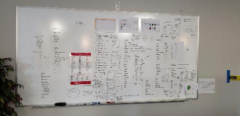
I sat in on customer calls in the support room. I gained access to a test environment and took inventory of all of SPOT’s features along with thier keyboard shortcuts. I even took the time to map out 30 years of settings on a digital whiteboard. We used this to go through each setting to decide what to keep or get rid of.

Most importantly, I visited dry cleaners to observe how SPOT was being used in the wild. (See Understand our Users) All this helped me identify the current state of our products.
Despite being the leading POS software in their field I learned Spot was riddled with issues. One of the biggest ones being built on old VB6 coding. This made it harder to be used on modern hardware and operating systems. This old code also limited the types of developers SPOT could hire.
Talking to customers, I learned that the UI was outdated and difficult to use. The system had become bloated from years of saying yes to every customer feedback. While customer feedback was helpful, Spot had created a monster by allowing customers to call the developers directly to request features. This bad practice led to a lack of strategy, thousands of settings, and complex workflows.
A majority of support calls I listened to were related to user errors surrounding those settings. Users changed the settings then broke the system, and then struggled to find them again. In some cases, these errors became very costly for the cleaners and took up resources from our support team.
One of the first major decisions we made was to stop allowing customers to directly call our developers. We removed the personal phone lines to the developers. We encouraged users to use the new support tools I helped create. I created forms and feedback emails to streamline customer requests. Working with the support team we began to establish protocols for how bugs, issues, and feature requests were to be handled. All major issues were to be created in Salesforce, which would then be placed in our developer backlog.
Key Findings
SPOT's desire to say yes to everyone left the system bloated, complex, and hard to use.
With developers in charge, there was no strategic vision, only knee jerk reactions.
Old code is difficult to support & hire new developers
60% or more of support calls resulted in a misuse of SPOT settings
Impact
Eliminated "All" developer interruptions from customers with new feedback forms
Streamlined support call protocols & reduced product bloat
Developer productivity increased significantly due to new feedback form
🔨 2.3 Tool Evaluation
Working with the product managers, I researched the best tools to meet our company's needs. I presented my findings and we decided to use Figma (Design & protoyping), Miro (Whiteboarding/Discovery), Hotjar (Gathering user feedback, recording user sessions), User pilot (Online Tutorials, & Training), and Monday.com (Managing product backlog separate from developer backlog). To maximize our effectiveness, I gave regular trainings to our devs on how to use Figma's dev mode.
We created a separate backlog for the product team where we could prioritize our tasks. Different statuses were created for these tasks specifically around the design workflow.
The statuses we used were :
New (Newly created not started)
Needs Requirements(Undefined)
In Process (Design, prototyping, Testing)
Researching
Needs Review (Needs to be reviewed by product)
Ready for Dev, Done.
Example 1

Example 2

Results: By introducing these new tools and processes, our team was able to have a better strategy and move more rapidly.
Impact
Tools evaluation fundamentally changed team communication, effectiveness, and strategy.
Newly established product workflow increased team productivity 10-fold
📈 2.4 Meeting Culture
While we were establishing new tools, I also helped establish weekly product meetings such as planning meetings, design reviews, research overviews, and usability testing. These meetings were planned at key moments of the week. I implemented a weekly design process based on the Google sprint method.

New Spot Method
Monday (Product planning meetings, stakeholder interviews, feature requirement sessions)
understand the problem
Flush out requirements
Prioritize tasks
Identify research needs
Prepare research questions
Tuesday
Sketch concepts (Low fidelity)
Find and contact customers to arrange user interviews with
Wednesday (Product design review)
Pick a design
Create Medium to High fidelity designs
Thursday (Product design review, Research review)
Review Designs with team
Make changes based on feedback
Create prototype
Write Usability Script
Friday (Usability testing)
Usability testing on site or in the office.
Subjects can be from support or customers
Gather feedback to present to council on Monday
At first, it took some convincing of the team to make these regularly occurring meetings happen. I knew the power of consistency over intensity would eventually change the culture of the company. The more we held these meetings, the more our team became excited and united behind our new product's vision.
Throughout each meeting, we identified which members of our team needed to be there. I formed a council of dry cleaning experts from other departments including: our implementation team, product, support leads and our lead developers. I lead these meetings and sent out agendas to keep us focused. Each member was crucial in making sure their voice was heard. These were individuals have deep knowledge of our customers and thier needs.
When designs had been reviewed, it was important to bring developers in at the right moment to help us determine how we would create the architecture for this brand new product.
I would often represent the users, as I had done research with them throughout the week, as well as usability testing in these meetings. After each meeting, I worked with the product managers to create epics, features, and user stories.

Separate meetings were held with just the product managers to flesh out the requirements of these tasks. Through training, I helped them write better stories. Rather than the product manager telling me how to design the solution, I coached them to focus on the problems at hand.For each task, we determined if additional research was needed and by which method we would conduct the tests.
Results
By having these regular cadence meetings, we slowly changed how new features were created. Decisions were no longer made in a vacuum but agreed on by the team.
Impact
Aligned strategic vision across multiple verticals.
Fostered cross-functional collaboration leading to better product design.
🧠2.5 Fleshing out Requirements
There was no shortage of ideas and where they came from. New feature ideas typically came from the following channels and sources
Feature request sources.
Product /stakeholders
Internal (Designs, developer needs. Ex ui fixes, stability fixes etc.)
User research
Support/Implementation calls
Feedback from surveyrs
Technological breakthrus
Looking at our competitors
In order to balance and prioritize all the feature ideas coming in I often held discovery workshops. During our discovery meetings, I would present my research and represent the user at all costs.Other times, we would discuss what features we wanted in this new product. I often conducted feature prioritization techniques where the council and I would add features we wanted in the new product. We tried to boil down the features to their essentials while removing access baggage from our legacy products.
We then would have them sort the sticky notes on a chart with four sections.
Easy to Build & Important
Difficult to build & Important
Easy to build but less important
Difficult to build and less important
Once the council placed their sticky notes on the digital whiteboard,we then made them prioritize which features we wanted to build. We weighed the pros and cons of pushing features aside.
Example 1

Results:
It was through these consistent efforts that I began to shift the culture of the company towards a user first mentality. Regular meetings to discuss features became the new normal.
Impact
Better prioritization of features led to higher adoption rates among customers for new app.
🩺 2.6 Addressing Dev pain points.
Up until now, in the companies history they had never worked with a designer. This brought many challenges. One of the biggest challenges was handing off designs to developers who had never worked with design before. Our team was stretched across the U.S., Ukraine and in India.
Knowing this would be a challenge I conducted several interviews with the lead developer. In this set of interviews I identified several pain points and frictions our developers had when using the new designs.
Developers Pain Points Notes
High fidelity mockups can be confusing to know what's final and what's in progress.
Figma is overwhelming to navigate in. Consider direct links to a prototype or feature.
Designers need to spec out each page; Developers need to break item on the page to determine the amount of effort it would take to build it.
Design should document for front end and back end development
Design documentation should include the look, behaviors, icons, settings, logic and context of why we are building the feature
Sometimes designs and documentation were not inconsistent.
Developers would prefer to have demos of the feature before being approved to see if there are any technical constraints.
Due to a long history of inconsistent coding making major changes would take up time, resources and it may cause larger bugs in the system. So basically not worth it.
It would be easier to make small changes slowly to the ui to fix the inconsistencies.
We could create new css classes and use them from now on which will allow major changed in the future. It would take awhile to setup but once done future changes would be alot easier to implement.
At the end of the day being inconsistent in the ui is a lower priority unless it affects the users ultimate experience with the site.
Developers would follow a style guide if the designers agreed it was the source of truth.
Results:
By identifying the areas I could improve on I was able to adjust to thier requests. This improved developer/ designer relationships significantly. By having more accurate designs it dramatically reduced the number of questions and ui work needed to complete design work. The developers also really appreciated that I took the time to work with them to be sucessful.
We implamented the following procedures following this interview
All Figma links will take the developer to the feaure in dev mode
Proptoype links are to be iclided with links to the feature
All documentation will include the UI needed, Assets, and Behaviors needed
Designs need to be approved by product and marked ready for Dev before going into sprint planning meetings
When designs are approved, prototypes and designs need to be demoed to the team
Style guides and better documentation will be handled in figma's design system
Impact
Protoypes reduced handoff questions & calls by an average 4-8 hours a week.
Style guides & design systems sped up production & scalability
Developer on boarding cut down by several months due to documentation
3.Research Phase
📎3.1 User Interviews (Research)
Over the course of my five years at SPOT I conducted many user interviews. Before going into an interview I made sure that each interview had an objective. Questions were prepared ahead of time to match our goals. While having a goal was important, I learned it was also important to be flexible. Almost all users I spoke with tended to go off on tangents.
Sometimes these tangents were fruitful and produced excellent feedback. Other times they would veer off course and it was my job to get back to the script. At the end of the day anytime we got to meet with our customers was a win everyone. It could sometimes take weeks to months to finally schedule an interview.
Because it was so difficult to find people and times to meet I implaneted a few strategies to combat this.
Using power automate I created a script that allowed emails to be automatically sent out to our users. This allowed me to email hundreds of people from our excel sheet. This cast a wide net and increased our odds of finding someone to meet with. Through the power of Power automate each email was customized to address to each customer by thier first name. These emails all used the same template and included a calendly link so the user could schedule a time to meet with me. Follow up automated emails were sent a week later to maximize the number of people we reached.

I made sure to allow users to customize how they wanted to meet with me. They could choose to meet via zoom, google meets or Microsoft Teams. Having this flexibility meant the users didn't need to download addition software just to talk to us.
At first I used to take notes during the call but that distracted from my ability to keep the conversation going. During the call I always reserved time for the users to provide any feedback they had about SPOT or Connect.
As I got more experienced I later made sure to record the session. Before AI I used to rewatch these recordings and afterwards write down any additional notes I had. Now using ai I was able to take the transcripts to help organize my notes and thoughts.
I still feel that ai misses some of the tones, body language and context of the interviews. I always review it's work to make sure it was correct. Towards the end of my time with SPOT I started creating tasks after each interview in our developer backlog to discuss with the product managers.
I realized that if tasks weren't created right after these interviews then sometimes their feedback feel through the cracks.
Example 1 User interview with Parkway cleaners. The user identified a bug where scanning a barcode added extra characters in the customer search. I encouraged him to share his screen and replicate the issue.
Key Take Aways
Always have a plan and questions ready before going into an interview
Allow users to decide when, where and how to meet
Don't take notes in the meeting do them afterwards
Always record the meeting
Ai is a good resource for transcribing meetings but make sure you add your own notes, quotes and observations
Arrive early to make sure your mic, camera and links are working
Immedietaly afterwards create tasks in the backlog so items are not forgotten
Impact
Increased the number of interview candidates per month thru the automated customized email in power automate.
Identified and clarified core issues and bugs, leading to improved customer satisfaction.
✅ 3.2 Surveys (Research)
Over the course of many months I sent out several surveys to better understand our user base. In order to find customers I worked with our implementation team to gather reliable contacts we could talk to. We created several surveys, conducted user interviews, spoke with our customer support reps. Whenever feedback came in from various channels I would schedule time as soon as possible to meet with our users.
Example 1

Example 2

Example 3

Findings
Users wanted better ways to search for lost garments in the system
This helped inspire us to search by taking a photo of the garment
Managers wanted better reporting tools
They wanted to createreport templates, search reports and organize them better
Surveys revealed training on SPOT is difficult
Users complained that thier database was full of brands that are similiar but spelled diferently. They wanted a master list with one spelling.
We learned SPOT crashed frequently
👓 3.3 Field Observations (Research)
From the very beginning I spent a lot of time shadowing several users in thier job. I reached out to many of our customers locally in Utah as well as across the United States. When possible I tried to meet in person on site. It’s one thing to talk on a video call but it’s another to be in person.
I met with business owners, front counter clerks and delivery drivers. Sometimes I would observe them for awhile asking questions afterwards. Other times I would sit down with them and discuss their pain points.


(Mr. Lee's Cleaners Draper UT)
While making obersvations I paid attention not only to how they were using the software but also to thier environment. Through these obersvations I noticed many cleaners post thier schedules on paper calendars, hand written notes were everywhere. Hotel manifest and invoices were printed out and stored in filing cabinets. I observed posters on the walls that told users how to remove stains or use equipment. Whenever I saw something done manually or by paper I took note of it as a potential feature/opportunity. All these things and much more helped to identify gaps that the legacy product was missing.


(Village Cleaners, Salt Lake City, Utah)
Key Findings:
One of the key oberservations early on was witnessing the awkward interaction of the user trying to predict the customers intentions because of how poorly our software was designed. SPOT was designed for the user to select the operation first before searching for a customer. This lead to the user needing to guess if a customer was going to drop off clothing (Quick), update a customer record, check the status of thier order or were picking up thier clothes. Often times I witnessed users click on an operation find out the customer wanted something different they would backout and click on the next operation before looking up the customer.
In order to look up a customer the user had to select how they wanted to look them up. I also saw that the system was designed to use old area codes so users made hacks to fit phone numbers with new area codes in the system.
These observations lead to a much better experience when it came to designing a better search. We decided to go with the natural conversations that the user had with the customer by having them search for a customer first then deciding the operation. Users could then type in a name, email, or phone number into a search field reducing clicks and saving the users time.
We anticipated the conversation would go from what can we do for you today? Oh we are dropping off let me get your name and number to Welcome to the cleaners can I get your name or number? What can we do for you today? This marked a major shift in how Connect would be different then SPOT.
Example 1

Example 2

Example 3

Impact
Redesigned user flow dramatically improved customer order accuracy
🗺️ 3.4 Journey Maps & Personas (Research)
In order to create the best understandig of our users base I spent some time working as a clerk and as a delivery driver. Being literally in thier shoes gave me a fresh perspective. I welcomed customers to the cleaners, took in clothing asked them when they wanted their clothes done.
This helped me our team understand that our focus for Connect would be on the counter clerk. While tools for managing the cleaners was useful we needed to design for the counter clerk.

Thier role was at the heart of every dry cleaning experience. They were the ones who took in clothes, set due dates, described clothing, worked in the back and were there to hand the clothes back to the customer. They were in charge of managing the cash drawers, assigning the price of the orders, and taking payments.

While the managers set the price, managed inventory and took care of the business it was the smiling faces of the clerk that brought in the money. Understanding thier role was crucial for success. create realistic personas. Ones that would actually create empathy and serve as a reminder of who we were building this product for.

Many managers I spoke with told me they lose several clerks each year due to being a summer job for college student. With each new feature SPOT became harder to train new employees. This told me that we needed to design this product in a way that would be simple to use and easy to train on.
Key Findings
Dry Cleaners have a heavy turnaround due to kids leaving for college
Journey map identified major pain points of users such as:
Constant interruptions
Inaccurate piece counts
Pressure to be accurate & speedy
Complicated training
Search is painful and confusing.
Subscriptions are created and sold as merchandise. Hard to find
Discovered new opportunities such as
Allowing users to enter coin rolls when counting the till
Giving end cunsumers the choice of where to have thier clothes delievered
The ability to capture photos of items to make finding them easier
English is often a second language for production workers. Make the app available in Spanish
Customers only get printed reciepts. We could do sms, email and other reciept types
and more
Results
Having a journey map and persona made it clear who we were building Connect for
Features reserved for managers were put on hold
This created better empathy for our team who is rremoved from working in a cleaner
🧪 3.5 Usability Test (Research)
Some of the best research I did while at SPOT came from doing usability testing. This was crucial in making sure were designing the right thing in those early days of Connect. Like all research methodologies I started off by asking what do we hope to learn/achieve? Without a goal or purpose testing users for fun would just be a waste of time.
Tests were conducted on Fridays at our home office as mentioned before. In some cases I drove to the cleaners armed with an ipad and a notepad to conduct the tests. Where possible we setup bagels or other treats to encourage a more relaxed atmosphere.
Every test I ran included a prototype, a test script and some scenarios we wished to test. Users were asked to sign a non disclosure agreement. As the test began I would engage in small talk then proceed to reading the test script. Each tester was asked a few back ground questions to know who was using the system.
This was helpful since a manager would give different answers then the counter clerk. With each reading of the script I emphasized that the user can't do anything wrong. If they made a mistake this would tell us how to improve. Most importantly I told them to be brutally honest. If the interface was ugly or bad we wanted to hear this and would not offend us. Only by hearing the truth could we build the best products possible. This was not a test of thier intelligence but rather to see if the designs made sense. I encouraged users to share all their thoughts out loud as they proceeded.
"The first thing I want to make clear right away is that we’re testing the site, not you. You can’t do anything wrong here. In fact, this is probably the one place today where you don’t have to worry about making mistakes...Also please don't worry that you're going to hurt our feelings. We're doing this to improve the app, so we need to hear your honest reactions."
Qoute from my test script When picking scenarios I tried to use ones that started off easy and got harder to help build the users confidence. Users were given a sheet of paper with the scenario on it. At the bottom there was a checklist of things to accomplish. Users were allowed to ask questions if the scenario was confusing. During the test I resisted giving them the answers. If they asked me for help I would tell them to do their best. I tried to record the sessions or have a notetaker be present. I found that if I took notes while the test was going on it increased the anxiety of the user. Once the tests were done I then showed them the answers and we discussed their experience. Users were then encouraged to share any additional feedback they desired.
Example prototype
Example story When designing our quick feature we wanted to know what information was most helpful to our users. We had some assumptions that they would want to see all thier disclaimers, coupons, and comments in one place. What we found was that the information we presented was overwhelming to users. Not only that but the designs didn't fit on one screen. These users needed to quickly press buttons to create new orders. Thanks to our testing we were able to simplify the experience making it easier and faster for users to use.
Example 1: Early concepts of our quick feature with the old branding and styles. Before

Through many iterations of desiging and testing plus a rebrand of the product here are the results.
After

Results:
Several developers were skeptical that usability testing was needed. They claimed they knew our customers and how they worked. The more we tested the more we discovered we had missed crucial features. This saved the development team lots of heartache, wasted time and yielded a better product overall.
Key Discoveries: Many times clerks descrbed and detailed the same shirt over and over again. This lead us to create the repeat button. This way whenever a user scanned a barcode and hit repeat they didn't have to enter the same details for that shirt. This saved the clerks on average 5-10 minutes detailing items
🎥 3.6 HotJar Feedback (Research)
Another method we used to gather user feedback was to integrate Hotjar into Connect. This allowed us to record user sessions and identify issues. Every morning I spent part of my day before meetings watching video clips and reviewing any feedback that came in.
Hotjar allowed use to create a feedback button users could click to take screenshots and give us feedback. I routed all feedback to come in though our newly created feedback@xplortechnologies.com email. Every 3 months I created a survey that would pop up in Connect to capture additional feedback.

(Feedback from Hotjar) Often times I caught issues before they were even reported by our users. There were times when a user would tell us about a bug and we were able to verify it by going to the recordings. This made it easier for our developers to see what was going wrong. One example of this was when we released a new time out feature in Connect. This feature puts the app in a time out status if the system is in a state of unuse. This way it prevents customers and other users from gaining access to the system. When we shipped the feature many of our users were set to go to time out after 1 second. This made the system impossible to use before going to time out. By watching the recording we were able to identify the issue and quickly resolve it.
Results: By implamenting Hotjar into Connect we were able to
Catch problems before they became an issue
Have a recording of issues to give to developers and the Quality Assurance team
Identify Usability issues with COnnect
Test hundreds of people without needing to contact users
Identify areas where users struggled and improve them
🤺3.7 Understanding our Competitors (Research)
When it came to conducting research for our competitors I looked at both our direct and indirect competition. An indirect competitor is anyone in another industry that has created experiences we like. A direct competitor is someone that is in the same industry as us. For our indirect customers I looked to companies such as stripe, McDonalds, and other companies to see how they handled thier point of sales products.
SPOT’s biggest rival is a company called SMRT. SMRT was created by a disgruntled former customer who thought he could build a better product more user friendly product. His biggest claim was that his product looked better then ours. At one point we were able to get a demo of thier product.
My anaylisis of SMRT was more user friendly but lacked the depth of our software. Many people former customers I spoke with regretted moving over to to them. I knew in time we would be able to create a better experience that not only looked better but met our customers needs. My main takeaways was not to worry about our competitor. If we focused on creating the best experience for our customers we would be light years ahead of them.
Results:
Competitive anaylsis revealed that competitors lacked the depth of our products
Many users regretted switching over to SMRT
We learned we needed to make our products simple to use while maintaining depth
Our competitor's product looked more user friendly but was lacking in design skills
⚖️ 4.1 Design Philosphy and Guiding Principles
One of the main goals of the product was not to reinvent the old legacy product. We wanted to build everything from the ground up. This meant not looking at old designs thinking of new ways to innovate and improve the dry cleaning industry. In order to bring good will to our customers and build up hype we let the users choose the name of the product. They chose to name it Connect. While I disapproved of the name the people had spoken.
In the begining I spoke with developers on the technical lifts and aspects needed for such a project. We decided we wanted Connect to be a responsive web app. Connect was designed to work on the latest POS touchscreens all the way down to an ipad mini. Over the months since starting the project it became apparent that this new product would need to be compatible with the old product. Whatever a user did in one product they could do in the other.
When designing we knew that we needed to support mulitple languages. Wording was simplified in order to make translation easier for our customers.
We also recognized that the new product would have a better workflow and be more natural to our users.
Some of the legacy features would need to be retired, some would need to be brought over and we wanted to introduce new features to our new product.
This decision would alter the future of our product in ways we couldn’t have imagined years later.
The main goals of the redesign was as followings:
Simplify and improve the user experience
Make it easier to find settings and operations
Reduce training and support calls
Eliminate tech debt
Innovate and improve our exisitng line up of products
Remove unnecessary notifications and bad workflows
Example 1.
The new detail screen is more streamlined, using a wizard to walk the user through the process of describing clothing. Users are able to take photos of items which makes them easier to find if lost.
🎨 4.2 Creating a Design System Form Scratch
Having built design systems in the past we started off with the basic elements we needed. Since this was a POS system designed for touch screens I knew our buttons would be big. I started off establishing some standards such as typography, font sizes, font weights, colors, spacing, and button design.
As we began testing I did some A/B testing to see which fonts users liked more. We choose to go with a readble and less common font. This helped give the app more personality without making it more difficult to use.
As the product grew and we had established design principles we added more components to our library. Where possible we would apply atomic design thinking and gave each component a purpose. Basic descriptions were added to each component rather doing elaborate documentation. A lot of research went into trying different fonts, icons, and headers.
Here is an example of how I built our buttons. Unfortentely I wasn't able to grab a screen shot of my work. I do have an earlier version you can see below Button specs
Created Spacing Variables
Used Spacing Variables (great for keeping things consistent)
Border radiuses
Padding
Margins
Created Text Vairables to save time typing
Names
Addresses
Phone Numbers
Heat Seal Labels
Set buttons to expand to meet the surrounding text
Used Auto layout with spacing specs
Created Variants
Type =Primary, Secondary, Tiererary, Icon
State= Hover, Resting, Default, Selected
Sentiment=Positive, Negative
Size= Small, Medium, Large
Icon= Leading, Trailing
Show/Hide Icon

Each component was built in similar ways. When possible I also created protoypes in the system. Ex. clicking on a checkbox would allow the box to change designs depending on the state it was in. This later made all checkboxes work in all my prototypes without needing to make them work in my design flow.
When the company was bought out in 2022 we rebranded connect to match the colors and fonts of Xplor. Each component was built to be themeable. Over time, we released tools that let users customize thier own themes. We even added additional themes for users to choose from. Different color palletes were made and could easily be applied to our components. To meet these demands, we limited our color palettes to 1-3 colors. System colors such as success, warning, and order statuses would stay the same for all users.
As the products grew so did our design system. This system was instumental in how we created consistent and usable products.
Example 1

Example 2

Results
Having a design system reduced confusion and kept things more consistent
New developers didn't have to build components from scratch
Became a source of truth for all components
Future designers could reuse established patterns and designs to save time.
Creating custom themes created good will with customers
🖌️ 4.3 Design Process
With over five years of designing for Connect it would be difficult to go though features I designed. For further explanations on any feature mentioned or not mentioned in this article I am happy to explain the process as long as it doesn't go against my non disclosure agreement.
With each design I went trough a similar process I would
Meet with product managers to to flush out the requirements
Ask probing questions and play devils advocate to unpack vague reuirements
Completed various types of research
Sketched out concepts
Designed features in figma
Reviewed designs with the product
Created protoypes
Tested and validated designs internally then with customers
Handed off to developers
Here are a few of my favorite screens to show case my design skills.
Example 1. Sketch Drawing for Webhook Feature

Example 1.

Example 2

Example 3

Example 4

🚩 4.4 Bringing our Apps under one Banner
As Connect began to take shape, we wanted to bring our flagship route manager too,l Delivery Connect into Connect. Delivery Connect was a separate product used to help dry cleaners manage their delivery & pickup routes. Users can create routes, preview their manifests, rearrange the stop orders, and assign drivers to them. Managers can get stats in real time about where all their drivers are at once.
Bringing Delivery Connect into Connect was part of a strategic move to simplify the number of products we supported, increase the number of users on Connect, and allow us to create better, streamlined pricing for our users. From a UX perspective, bringing these products together meant aligning the styles, experiences and data with the rest of Connect.
I worked with developers to provide style guides, designs and guidance for how this should be accomplished. We were able to create a separate roles within the system to allow users to navigate between the two products. Users who were assigned delivery based roles could access Delivery Connect. If a user had multiple roles, they could access the counter tools in Connect as well as the delivery tools.
While we were working on this project, efforts were made to add much needed functionality and improvements. We streamlined customers records to share one experience, added new features that allowed users to visit inactive or missing customers, added better functionalities for hotel customers, and fixed major usability issues and more.
Example 1. Delivery Connect In SPOT

Results:
Bringing Delivery Connect into Connect was a huge success.
Merging them together brought large numbers of people to adopt Connect.
Creating one customer record between the apps simplified the experience
New improvements to rearrange and type a new stop number saved managers hours of writing manifest changes by hand!
New zone creation tools were more intuitive to draw areas on a map
🚀 5.1 Launching Connect
Connect took several years to get a fully functioning product to our customers. Hype for Connect began when we unveiled in 2022 at our Clean show Conference in Atlanta. Any user that wished to join our beta program was encouraged to sign up. Some beta memebers were choosen as well to provide us with additional feedback.
Because of our decision to be tied to our legacy product whatever actions they took in legacy would happen in Connect. Special processes were created to integrate thier data from our legacy apps to Connect. Early beta users could perform basic functions such as taking in clothes (Quick), describing items (Detail), production workflows (Racking, Pressing, Bagging) and accepting payments (Pickup) within the application. Unfortunately, settings, managing pricing tables and other managerial operations can only be used in SPOT. Many technological breakthroughs were made in Connect allowing, barcode scanners, credit card machines, printers, cash drawers, webcams, giant conveyor belts and more to be used on the web.
New features were added to Connect that dramatically changed the way the industry worked.
While each feature is worthy of it's own case study, here are some of the highlights, including:
Simplified user experience.
New & Improved UI
Responsive Web Based app (Supports Desktop & tablet)
Customizable Theming to match customer brands
Multi Language Support
Better Reporting tools
Onboarding tuotrials & training
Powerful google like search bar (Allows users to search by name, number, email)
Garment Search (Allows users to describe clothing in the system to find an item)
More ways for customers to recieve thier orders (Delivery, Pickup, Locker, Other Store)
Digital Signatures disclaimers for high risk items
Ability to take photos of items and apply notes to the item
Integrations with R4. This partenership allows users who buy clothes from amazon to return them to dry cleaners to celan them and ship them back to be resold
And so much more
With the release of Connect to Beta we integrated tools such as Hotjar to monitor user behaviors. Anayltical tools were also added to track where users were clicking.
Impact of the Beta
Improved stability for both legacy & modern applications
Addressed major bugs
Fixed usability issues such as hard to navigate betweeen orders and items
Better confidence in our products from beta users
UI improvements & inconsistency fixes
Better fixes for translations
Introduction of major features such as:
R4 Amazon Integrations
Customizable Dashboards
Theming tools
Applying notes to photos
Selling subscriptions at the customer accont level
🔮 5.2 The Future of Connect & SPOT
At one point in building Connect the stake holders became anxious at how long it was taking to design, innovate and create all the features of our legacy product. While the product was being used by our customers many of them had to switch between the legacy product & Connect. This caused friction and made it harder for some users to adopt Connect. Our developers estimated that the current pace we were on would take 8 years to bring all of SPOT over to Connect.
This did not include stability issues, bug fixes, innovations and other improvements to both the front end and back end. A solution was proposed to update the legcay code and then merge our legacy product SPOT with Connect. We found a company called Fecher, located in Germany, that we could pay to convert our old code to a modern code.
Converting the code would bring better stability, a chance to upgrade to a 32 bit application,faster sppeds and bring all our missing features to Connect. We could also hire more developers to improve the products. There were many risks and tradeoffs by doing this as well. From a design perspective, Connect & SPOT are very different products. Connect was designed to simple to use, added innovations and had a different workflow. As the company was choosing to go through with this I created an inventory of all of SPOT's features. I then created a report of all the risks and challenges it would take to merge these two prodicts together. Here are some of the challenges I identified Challenges and risks of the merge:
This included finding ways to navigate to the missing features
Making sure the keyboard shortcuts were similar
Switching between old and new ui
Theming merged features
Translating old features into different languages
Reworking many features to work with the new and improved workflow.
Bloating exisitng screens that were created to be easy to use
When the contract was signed with Fecher I worked with our the developers to form a strategy. Bringing these products together would be a large under taking. Since the old legacy experience was vastly different from Connect I took an inventory of all of the major differnces. Some workflows would be replaced with the new sleek Connect workflow, others would use SPOTs workflow and some features would need to be reworked entirely. In the end the company decided it was worth the risk to bring these products together. They signed the contract and I was appointed to oversee all ux efforts.
My role
Provide styles and UI Mockups to align legacy SPOT with COnnect
the same fonts, colors and styles of COnnect.
Take inventory of all SPOT features
Identify each feature as follows
SPOT features needed to be retired
Connect features to replace SPOT features
Gaps between SPOT & Connect
Features needed a UX/UI rework
Features could use the old UI with Connect styles
Provide video tutorials for the German team for how SPOT works
Map out where to put all the missing features from SPOT to Connect
Provide Icons and essential assets needed
Example 1 Part of the map that shows where we would put the old search experiences into Connect

Example 2 Another part of the map to show where we could navigate from our new operations to the old ones

Example 3 Another map depicting where our gaps and missing features were related to our system features

Throughout this process I worked tirelessly with the product team to put every SPOT feature in our backlog. We created epics and features then tagged them by how we wanted to bring them to Connect. Notes were made where there were gaps and other issues. Keyboard shortcuts were added to our notes so we could strvie to have a parady with the old system. We wanted to make sure peoples muscle memory stayed the same.
While this would be the last major effort I would do for SPOT this laid the ground work for success in bringing these two products together.
Lessons learned
Working with the German team they took everything literal.
Be very intentional about what files, videos and demos we gave them.
Always get feedback on the style guides and hand off files. Don't assume they won't have any questions
Plan more meetings to review UI questions
5.3 Laundro mats + Dry Cleaning
As the Connect project was coming to a close, SPOT began to set thier sites on new ways to bring in new revenew. The Laundro Mat business has always appealed to dry cleaners after all they are like distant cousins. In many ways cleaners already off similar services. By breaking into the laundro mat industry this would allow them to cash in on the customer base that prefers to do thier own laundry.
In order to break into this industry I was asked to approach this project the same way I had done for Connect years ago. I began to go to several laundromats and be a customer. I honestly had never been to a laundro Mat before. Armed with a pen, paper and some blankets, I visited Speed Queen and Laundry King located in Utah.


The basic flow for laundromats is different then it is for dry cleaners. While both locations I visited were different they both had similar concepts. Laundro mats typically are self serve. It is rare for there to be a person on hand to help you out. Some laundromats allow you to buy soap and dryer sheets, others require you to bring your own supplies.
Here was my experience at Laundry king
Washing Machine Flow
Downloaded the app
Used touch screen on washing machine
Could not figure out how to pay (no credit card reader)
Tried the app, but could not upload credit card successfully
Used the kiosk to pay and select machine
Returned to machine and hit start button
Added laundry soap
“It was confusing at first. There was no card reader, and my credit card failed in the app.”
Dryer Flow
Loaded clothes into dryer
Opened the app
Looked up dryer number
Scanned QR code
Used rewards program in app to pay
Hit start
Was supposed to get an sms notification when it was finished but never did

Key Features Observed
App shows which machines are available
Machines have touchscreens
Each machine has a QR code for app-based control
Kiosk-based payment system supports cash
Machines support multiple languages
App includes rewards program and tracks usage
SMS/email notifications available 3 minutes before cycle ends
No employees on site
App displays time remaining on machines
Price changes based on selected services
No detergent or supply vending on-site
No wall/ceiling displays for real-time machine status
Opportunities for Improvement At the Laundromat Level
Install digital display boards
Show machine availability in real time
Reduce app reliance for customers on-site
Introduce detergent/supply vending
Add value and capture more revenue
Dryers and washers don’t offer basics like detergent or dryer sheets
Add lockers for drop-off services
Could support future wash & fold or dry cleaning pickup partnerships
Fix kiosk↔app sync gaps
Ensure payment via kiosk still enables notifications
Add tutorials or first-time user guidance
Confusion during payment could be avoided with a short onboarding flow
Enable full-service staff contact or remote support
Even a digital help button would improve confidence in a no-staff environment
Not only did I visit several celaners to see how laundro mats worked I also looked at our competitors to see where our feature gaps were

Results
Due to buget cuts I never completed my research. Yet despite this I was able to lay down the foundation for how SPOT could break into the laundro mat industry.
🎓6.1 Lessons Learned
Here are some of the biggest lessons I have learned since joining SPOT.
Without follow up "we will do this later" means it won't happen
Capture feedback into the backlog when you get it
Always do your best work because you may never visit that feature again
When you make promises at a user conference to deliver features keep that promise
Before chasing the next shiny feature make sure you finish what you started.
Be willing to fight to get research done
Dream big
Involve the developers in the design process before it gets approved
Seek allies in other departments to share knowledge
The best way to develop empathy for your users is to walk in thier shoes
Stay hungry to learn and never platuo
Understand the technology and methods used to make the design
If I could go back in time I wished I had asked more questions with our developers. They wrote Connect in a coding language that was not common. Later we learned support for this code was going away. We are now faced with having to convert Connect and SPOT to modern coding languages. This would have saved us so much time and money. While the product works beatuifully it could have had a better foundation.
📈6.2 My Impact at SPOT
In the short five years I had been with SPOT I was able to bring the company and it's culture to the modern age. Here is what I accomplished in that short amount of time.
Customer Impact
Replaced outdated 1990s software with sleek modern responsive web-based product
Shifted industry from CDs, & applications to modern web-based app.
Uncovered new opportunities & features through extensive research
Tackled decades of accumulated settings & usability issues
Reduced & streamlined training of new users in a high-turnover environment
Simplified user experience resulted in noticeably faster & more accurate sales
Empowered customers to fully customize their mobile & web-based experiences
Overhauled mobile apps for delivery drivers and dry cleaner customers
Company Impact
New product dramatically shrank call volume in customer support
Shifted company culture towards a user-centric approach
Cultivated a design-thinking mindset within the company.
Implemented technical documentation to smooth designer/developer handoff
Established POS Design System to save time on designs and money
I am forever grateful for my time with SPOT. This has been a once in a lifetime experience. It's very rare to have an experience like this to build a product from scracth. I couldn't have done this without my incredible team to back me up and provide me with the resources to build the best product possible. Thank you for taking the time to read through this case study or even parts of it. If you have questions about this product that were not answered in this case study reach out to me.
📜 7.Recommendations
Here is what my product managers had to say about my role in this project.
7.1 Product Manager Recommendation

Wash Respess
Product Management
Xplor Technologies (Spot Business Systems)
"I have had the pleasure of working closely with Brandon Porter on several UI/UX design projects, and I cannot recommend him highly enough. Brandon has an exceptional eye for design, and his ability to translate complex ideas into intuitive and visually appealing user interfaces is truly impressive. He consistently delivers designs that not only meet but exceed expectations, demonstrating a deep understanding of user experience principles and best practices... One of Brandon's greatest strengths is his collaborative nature. His excellent communication skills and willingness to listen to feedback make him a valuable asset to any team. Beyond his technical skills, Brandon's passion for user experience design is evident in everything he does. "

David Radzialowski
Product Management
Xplor Technologies (Spot Business Systems)
I had the opportunity to work alongside Brandon, a truly talented UX Designer with a deep understanding of design principles and an impressive command of the UX tool suite. Brandon approaches every project with contagious enthusiasm — he’s genuinely excited about understanding users, uncovering their needs, and designing thoughtful, intuitive solutions that make their experiences better. His passion for solving user problems fuels the entire team and inspires collaboration and creativity at every step. Combined with his mastery of UX design principles and tools, Brandon’s energy, curiosity and drive make him an invaluable contributor to any software development effort.